
In the US, most of the us are aware of The Americans with Disabilities Act (ADA). This civil rights law prohibits discrimination against individuals with disabilities in all areas of public life, including employment, education, transportation, and public places or private places that are open to the general public. The purpose of the law is to make sure that people with disabilities have the same rights and opportunities as everyone else.
Parking lots, for example, must conform to certain standards according to the ADA Act. Did you know that websites are also included? The Web Content Accessibility Guidelines (WCAG), created by the World Wide Web Consortium (W3C), are a set of web standards that aim to make the internet a more inclusive and accessible space for all. Following WCAG guidelines ensures that your website is accessible for users with disabilities and is a major part of being compliant with the ADA and other accessibility laws and regulations.
Only 3% of the internet is accessible for people with disabilities, but that is changing for the better, and you can be a part of the change. Not only will doing this protect your business from a lawsuit, but it will also make your brand available to more people (which is awesome). It may also help your bottom line by allowing everyone to navigate your site.
Your website most likely has accessibility issues. Here are some of the most common errors (that are also easiest to fix):
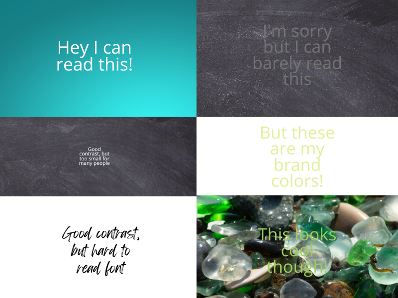
Colour contrast is not high enough for people with low vision or vision issues
When you put text on a background, you have to consider how easy it is to read. In essence, it needs to be of a high enough contrast to stand out. Your site may look cool, but style over function is the downfall of many business owners. People with low vision or vision issues may also have trouble reading the text if it is too small or in an intricate font. Here’s a great contrast checker that you can use to plug in the colors of your website’s text and background to see if the contrast meets the guidelines. You may be VERY surprised (we were!!).
Your text is too small
For traditional computer monitors, a size of 12pt (=16px) for body is generally recommended for body text (depending on audience). You need to ensure that default fonts are no smaller than 9 pt (=12px). Smaller sizes may be illegible on some platforms. The WCAG Guidelines recommend that text can be zoomed to 200%.
Images on your site have no alt text
“Alt text” is what people with visual problems will rely on when encountering images on your site. The “alt text” is what their screen readers will read out to describe what the image shows, so it could be anything from, “Black large dog sitting on a green rug” to “Bar chart showing the percent of website home pages with accessibility errors for the years of 2019, 2020 and 2021”. If you don’t use alt text, millions of people won’t notice any of your pictures.
Links on your site contain no anchor text
When you place a link on your website, it’s very helpful to give visitors an idea of the intent of the link. For example, if we wanted to link to our favorite Tibetan Healing Sounds video, the words ‘Tibetan Healing Sounds video on YouTube’ would be the anchor text. If you don’t use anchor text, and instead just put the full URL in your content, it can be harder for screen readers to read out, and it also is much less inviting to click.
Anchor text on your site is not descriptive
Anchor text should say what clicking on it will achieve, or where the link will take you. Undescriptive links say things like ‘learn more’ or ‘click here’ (we see these all the time, don’t we?). If you’re just skimming the page and see those links out of context, you won’t understand what they’re for, and you probably won’t engage with them.
Main menu cannot be navigated easily
Screen reader users navigate using the Tab key. Can you go from page to page in the menu with the tab key? If not, ask your web developer (or us) for help.
Forms are difficult to navigate
As mentioned above, screen reader users navigate using the Tab key. Although labels are announced when form inputs received keyboard focus, other text between the form controls is usually skipped. Be sure to include any instructions at the beginning of the form.
Give users enough time to fill out forms or checkout
Many websites will time you out if you don’t complete your order on time. That is frustrating for all, but especially if it naturally takes you longer to do things online. People who can’t use a mouse, or who can’t read, or can’t see, will take longer to perform the same actions, making time-outs impossible to beat and sites impossible to use.
Want to make sure your website appeals to more people?
This list is by no means exhaustive or complete, but it is a great start to making your website more accessible to more people. It’s a good thing to do! If you have questions or would like help with your own website, please send us a message.